Kakeru Finance
A DeFi startup needed their staking and lending app to make sense to actual people. I designed the dashboard and the flows, built a full design system, and handed it to their developers ready to build.
- Role
- UX/UI Designer, end to end
- Timeline
- 2025
- Platform
- Web app (DeFi)
- Tools
- Figma
Status · 2025
Kakeru wound down later in 2025. The work below stands as an end-to-end product design and design-system delivery for a complex DeFi platform.
Overview
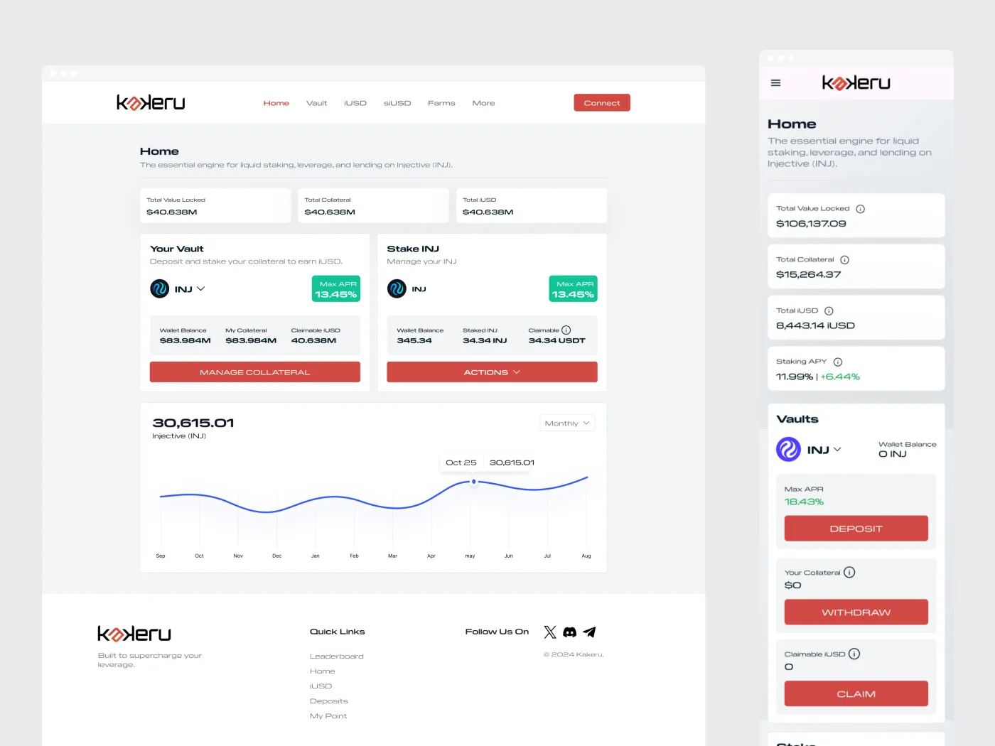
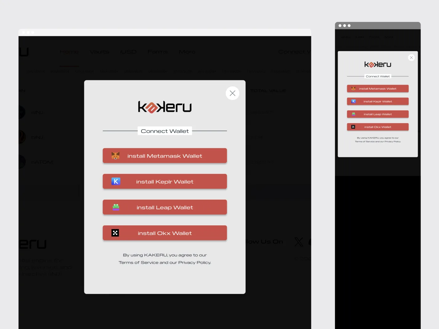
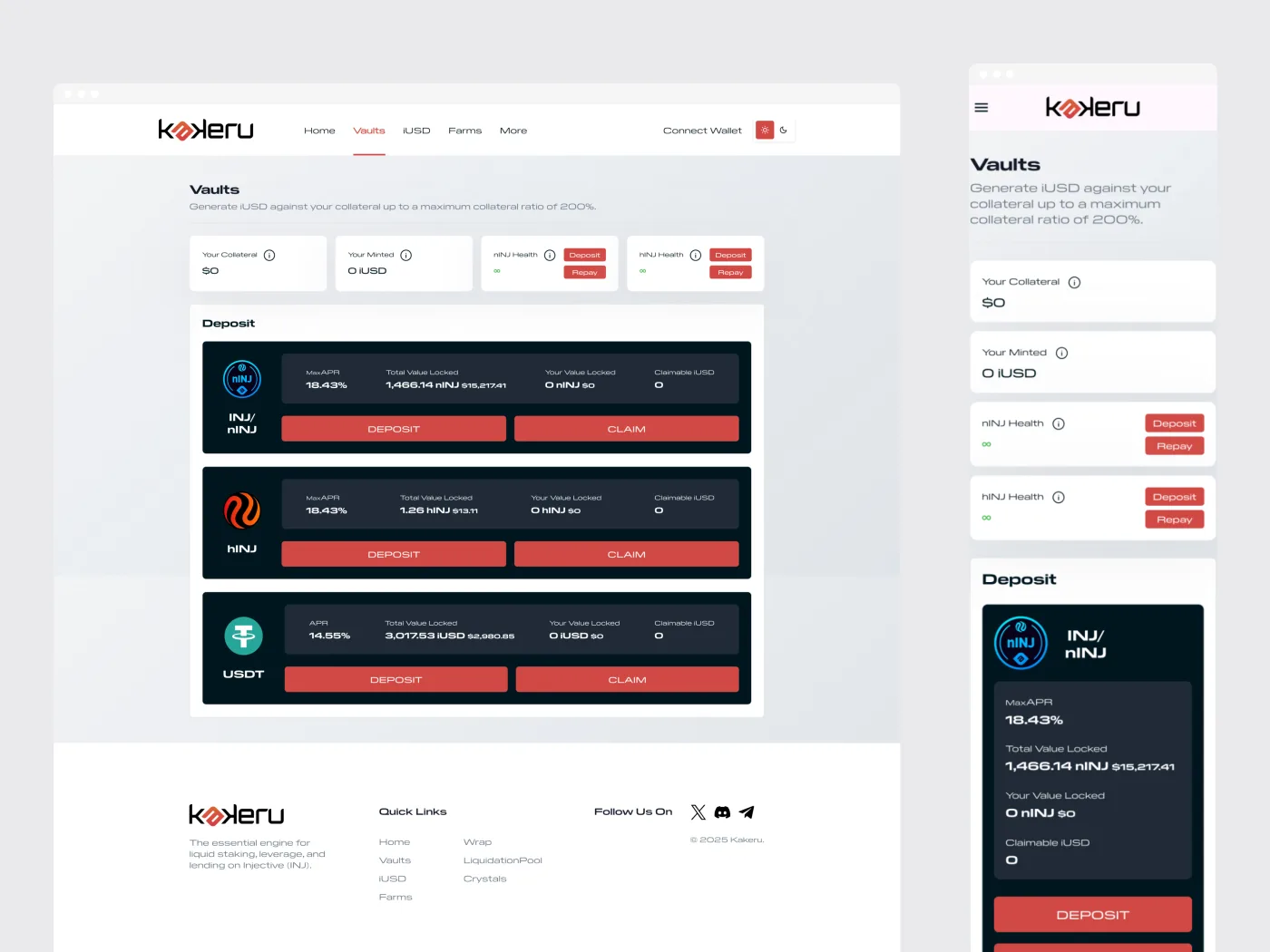
Kakeru Finance was a DeFi platform built on the Injective (INJ) blockchain, centered on liquid staking, leverage, and lending. People used it to stake INJ for a liquid token they could keep putting to work, provide liquidity, borrow against collateral, and track how their positions were doing. The hard part with DeFi is that the underlying mechanics are genuinely complicated, and the site they had, built by a series of developers before me, made them feel even more so. My job was to make something this complex feel approachable.
Discovery & planning
I started by sitting down with the product and engineering teams to really understand the DeFi mechanics, because you cannot simplify something you do not understand yourself. I mapped the user journey from connecting a wallet through completing an action, and worked out which numbers people cared about most: total value locked, APR, claimable rewards, and wallet balance. Those became the things the interface led with.
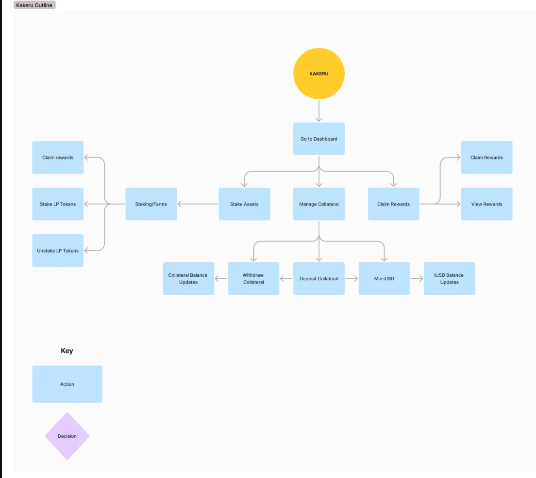
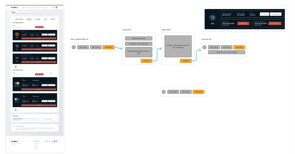
Wireframes & flow
I worked in low fidelity first, laying the dashboard out around card-based modules: vault deposits, staking, collateral states, and the charts that show performance. Cards kept each piece of a busy screen contained and scannable, with a clear hierarchy so the important things came first.
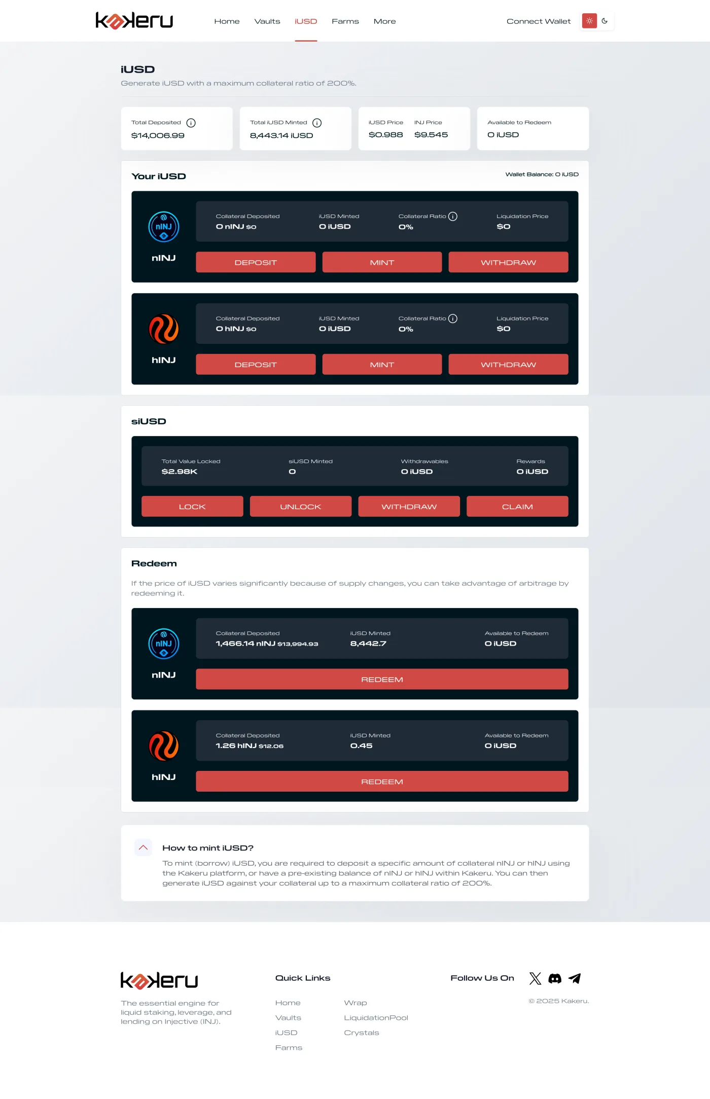
UI design
The final UI sat on a calm, neutral background so the data and the actions stood out, with bold color doing the work where it counted. Actions were color-coded to read at a glance, like red for withdraw and green for APR. The whole thing was responsive, so it held up on a laptop or a phone.
Design system
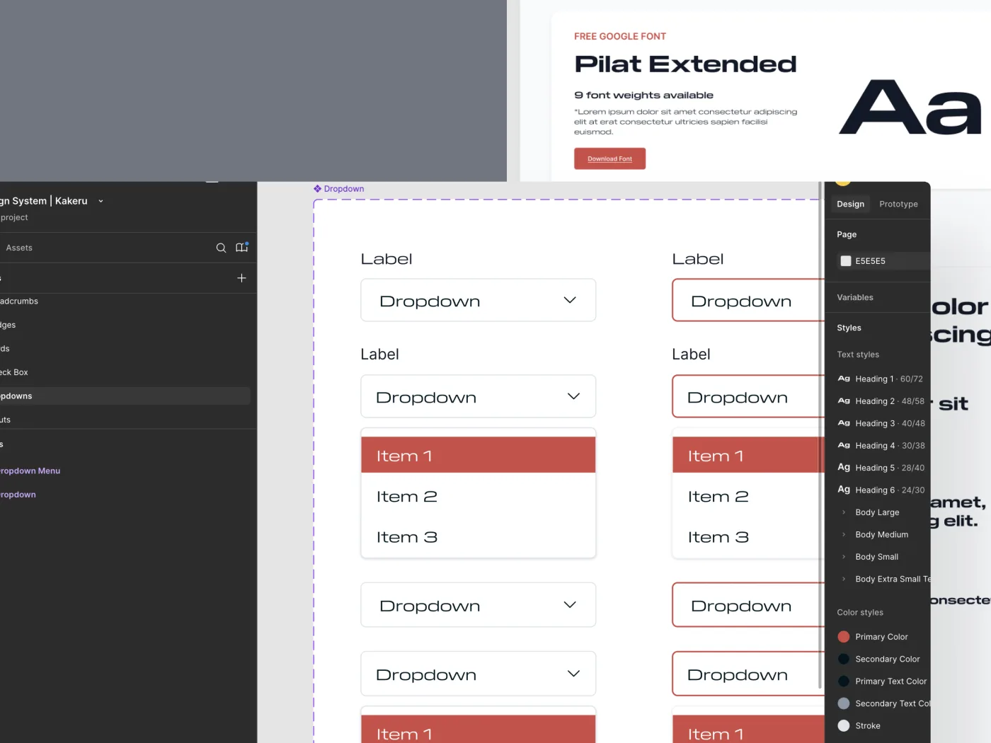
I built the whole thing on a proper design system: typography, a color palette, token icons, and reusable components like token cards, APR badges, dropdowns, and data tables. That consistency is what kept a data-heavy product from feeling chaotic, and it made the handoff far smoother.
Developer handoff
I gave the developers Figma files they could build from straight away: labeled layers, component variants, and documented conditional logic for the trickier states. I stayed available through the build to answer questions as they came up.
- Figma files ready to build from
- Labeled layers and component variants
- Documented logic for the trickier states
- Support through the build
Outcome
The result was a DeFi product that finally matched the protocol underneath it. Complex staking and vault actions became easy to follow, and the documented design system gave the team a foundation they kept consistent through the build.
Outcome
End-to-end product design and a documented design system for a complex DeFi platform. Kakeru wound down later in 2025.