The Fashionable Frequent Flyers
Two travel bloggers had outgrown the site they built themselves. It was slow, flagged as insecure, and looked dated. I rebuilt it as one home for their stories and their shop.
- Role
- UX/UI Design & Build
- Timeline
- 1 month (2023)
- Platform
- Blog + E-commerce
- Tools
- Figma, WordPress, WooCommerce
Overview
The Fashionable Frequent Flyers is a luxury travel brand run by Justin and Linda, a couple who document culturally conscious travel and fashion from around the world. They had built their own WordPress site to get going, and it had done the job, but they had outgrown it. They wanted something that looked the part and could sell, alongside the stories they were already telling.
The problem
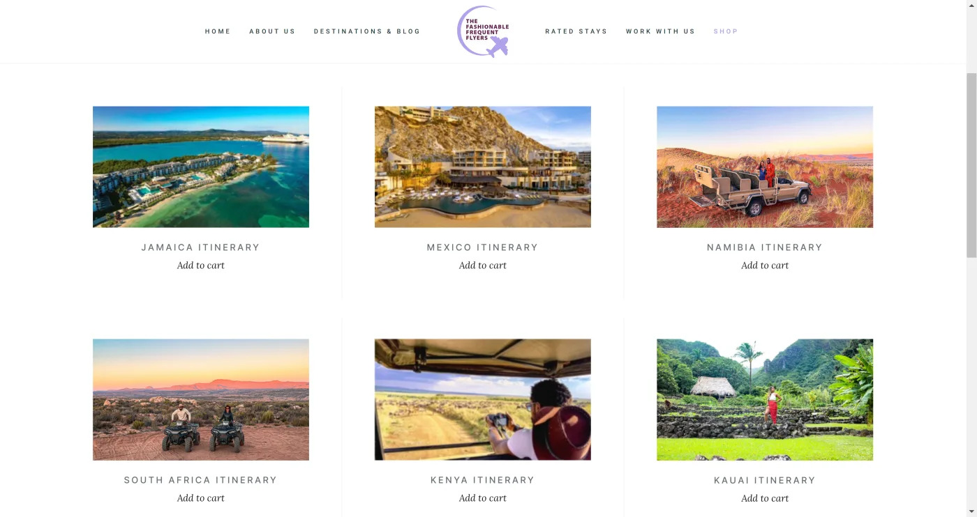
The site they had built themselves was showing its age. It ran slow. The SSL certificate was not set up properly, so browsers kept flagging it as insecure. And the design had fallen behind the quality of the content going into it. There was also no way to sell anything, which they wanted to fix.
- Slow to load
- Flagged as insecure
- Design behind the content
- No way to sell
- Fast, with speed as the first principle
- Proper SSL, no more warnings
- A look that matches the brand
- A store that sells direct
Research & discovery
Justin and Linda came in knowing who they admired. They pointed me to a handful of popular Instagram accounts in the same culturally conscious travel and fashion niche, which gave me a concrete starting point. I pulled apart how those creators had built their own sites, the way they organized content and where they drew the line between telling a story and selling, and let that shape the direction here.
Process
I rebuilt the site on WordPress with speed as a first principle, since slowness was the loudest complaint about the old build. I fixed the SSL setup so it stopped getting flagged, then worked through the redesign page by page.
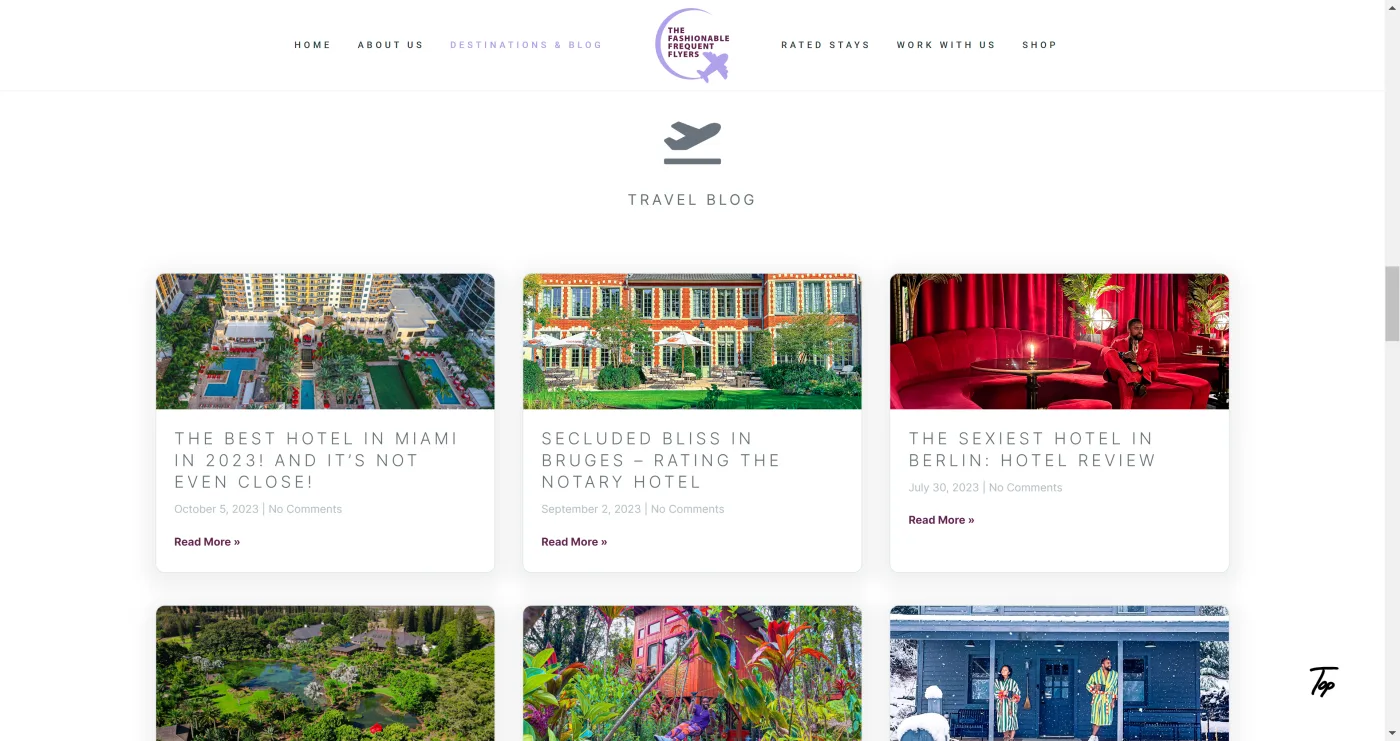
The brief was really two sites in one: a blog that does justice to their travel and fashion content, and a store that lets them sell. So I designed the two to live together, with clear paths between reading a story and browsing the shop.
UI & visual design
The look they wanted was classy and luxury, but still modern. Justin and Linda kept pointing back to the Instagram accounts they had shared early on, so I used those as my reference for the feel: clean and image-led, premium without trying too hard.
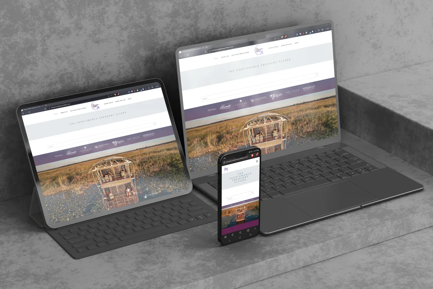
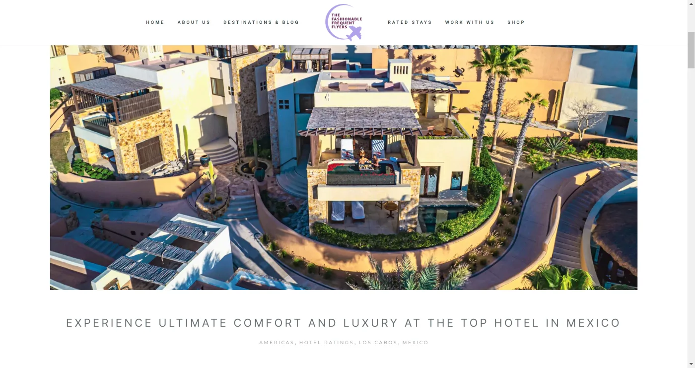
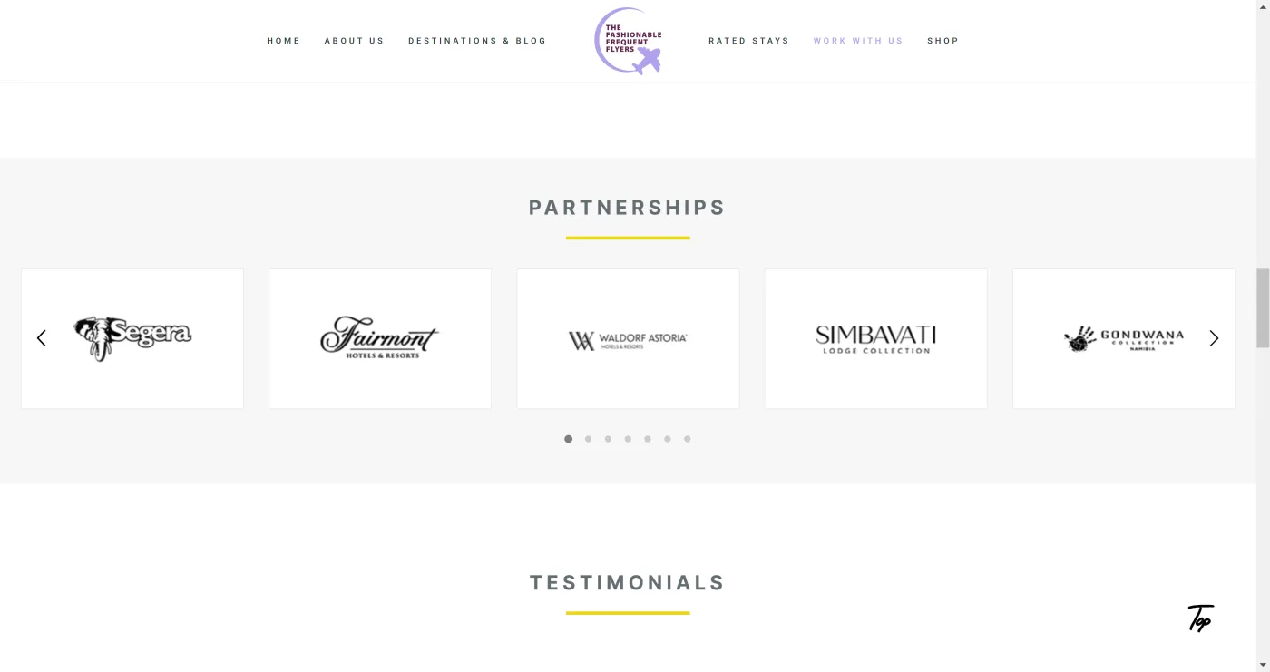
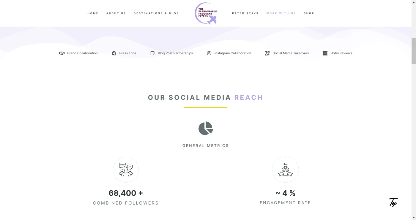
The redesign covered the whole site. New blog and article layouts built around their photography, a shop for selling direct, a partnerships section for their brand collaborations, and a dashboard that pulls their social media metrics into one place. The visual design was brought up to match the work they were already putting out.
Outcome
Justin and Linda went from a slow, self-built site to a fast, secure one that finally looked like their brand and could sell as well as publish.
Outcome
Took a slow, self-built blog to a fast, secure site that finally matched the brand and could sell.