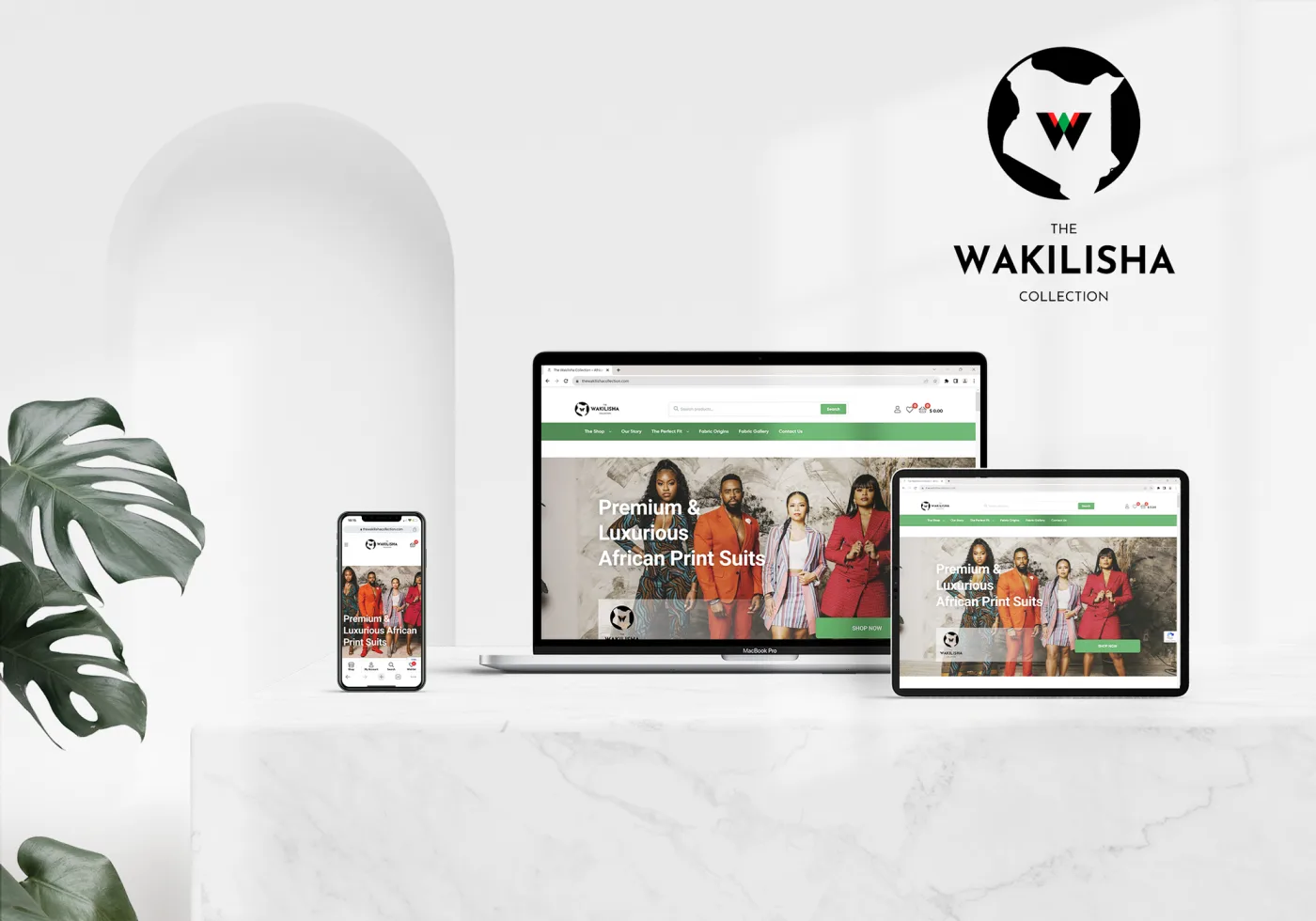
The Wakilisha Collection
A luxury apparel brand selling African-print suits had cycled through several failed redesigns before they reached me. I rebuilt the store on a clean, mobile-first foundation, with a checkout designed to stop losing customers halfway.
- Role
- UX/UI Design & Build
- Timeline
- 6 weeks
- Platform
- E-commerce
- Tools
- Figma, WordPress, WooCommerce, FunnelKit
Overview
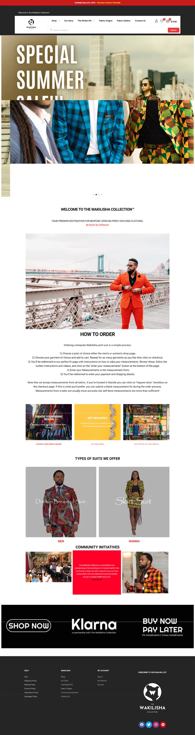
The Wakilisha Collection sells high-end suits and separates cut from African-print fabrics, with sourcing rooted in Kenya. The clothing was premium. The website was not. By the time the brand reached me, they had been through more than one developer and more than one redesign, and none of it had stuck.
The problem
The old site worked against the brand at nearly every step. Colors and fonts shifted from page to page, which watered down a label that was supposed to read as luxury. The navigation left people guessing. Most of the traffic was on mobile, and that was exactly where the site struggled most: slow loads and features that broke outright.
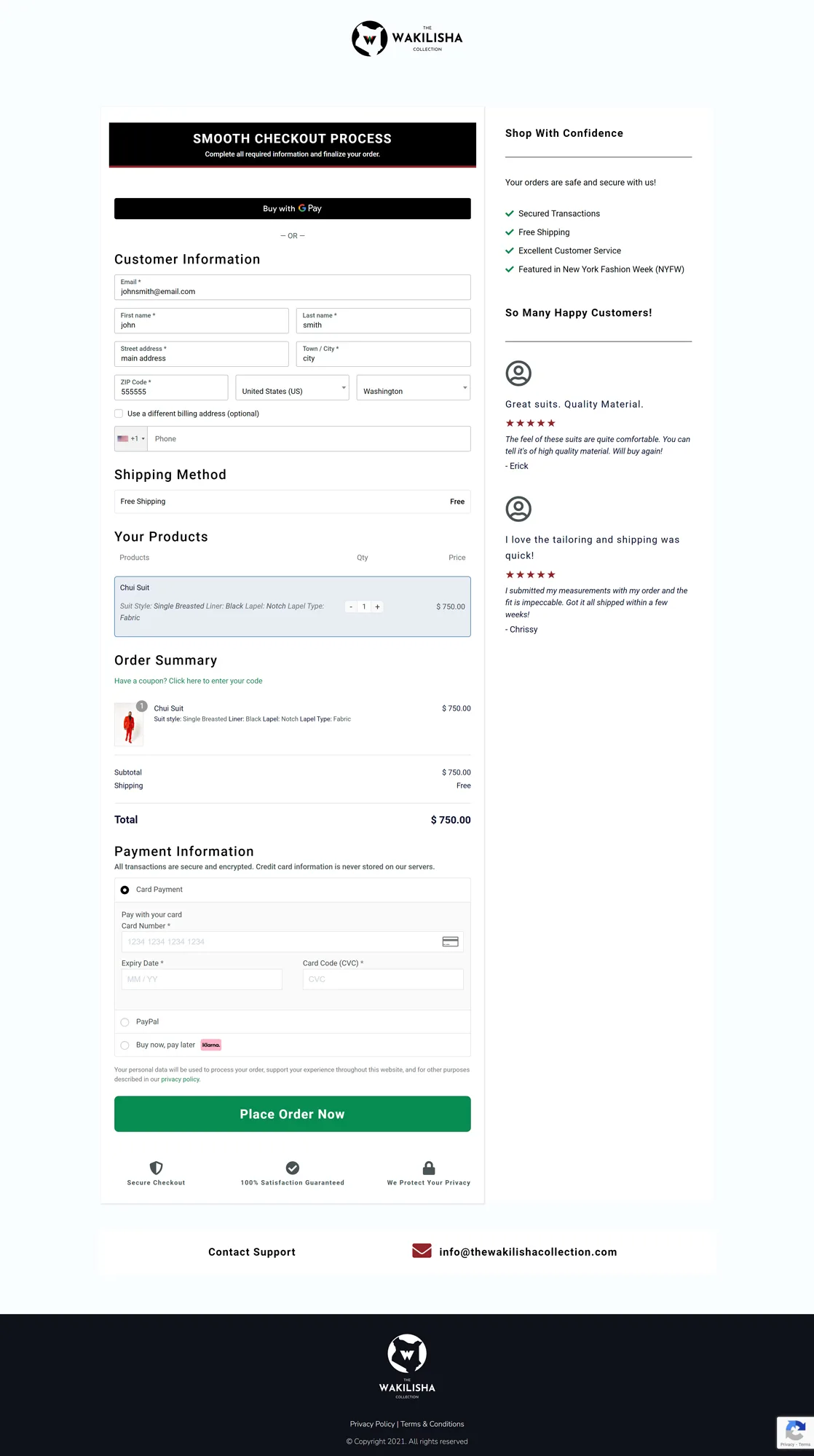
The checkout was the worst of it. A glitchy cart and a long multi-step process handed customers every reason to give up before paying. Plenty of them did.
Research & discovery
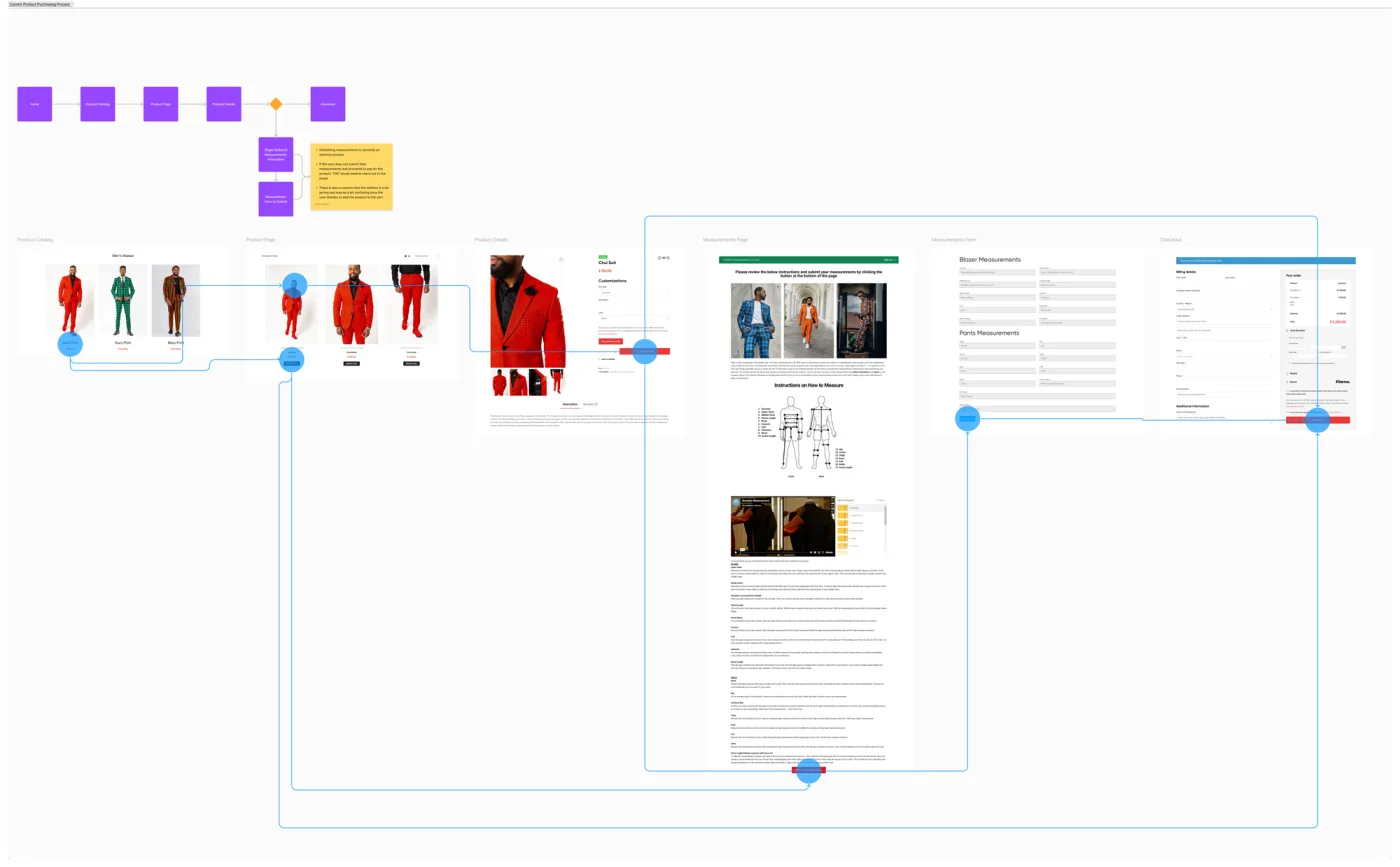
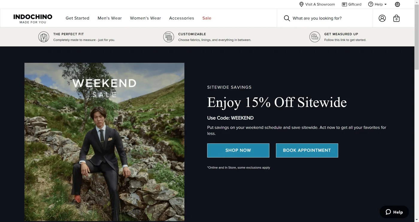
Before designing anything, I mapped how a real customer moves through the site to buy, from first landing to final payment, and flagged every point where people dropped off. I studied how stronger names in the space solved the same problem, Indochino among them, and worked out why their flows felt so easy to move through. I also got specific about who the Wakilisha customer is and what they expect from a premium brand online.
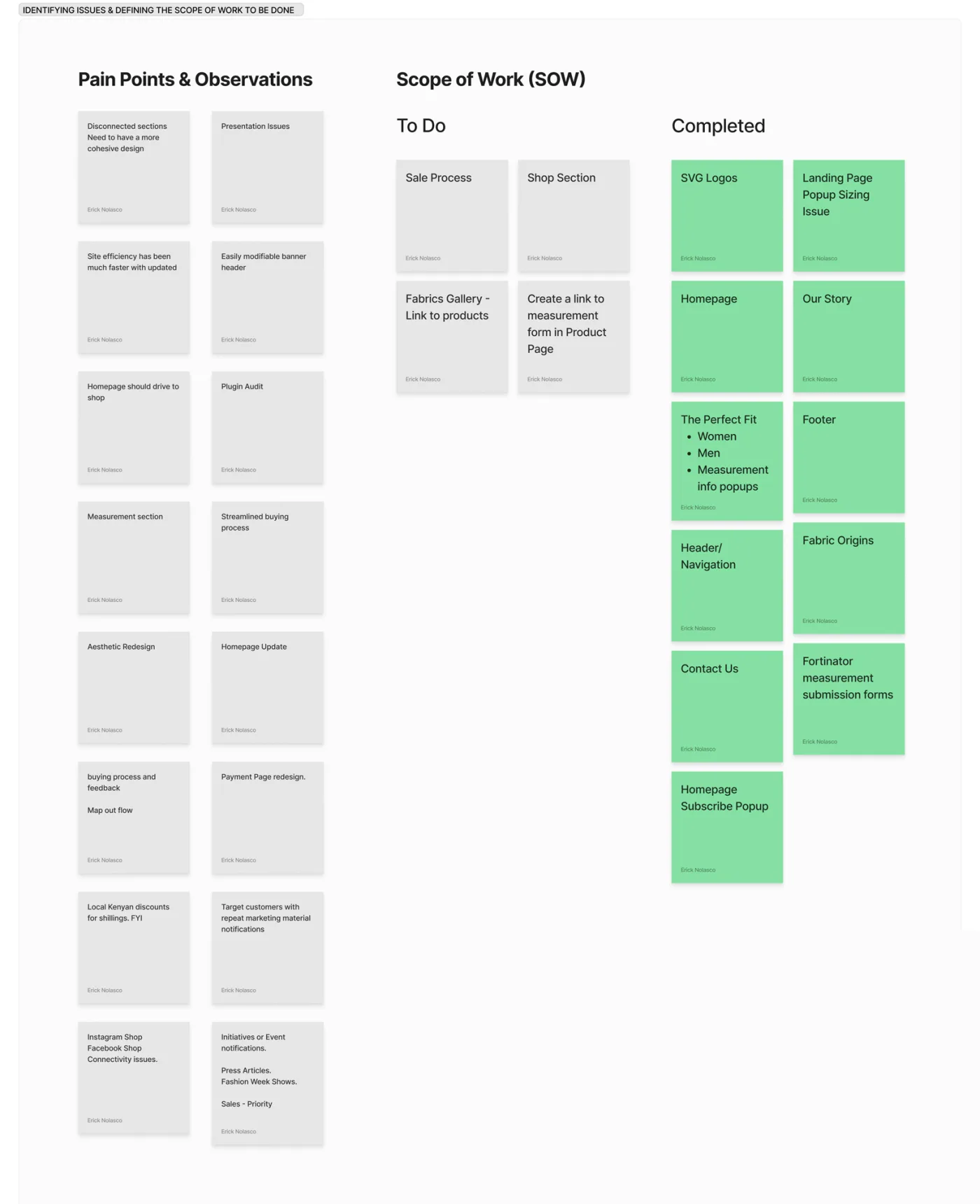
Process
I ran the project in clear stages: discovery, wireframing, design, build and testing, then launch. Early on, I laid the whole problem out on a whiteboard, the broken pieces and the full scope, so the client and I were working from the same picture before anything got designed.
I used AI tools through the project, Claude, Grok, and ChatGPT, to move quickly on research synthesis and first-draft copy. The design decisions stayed mine.
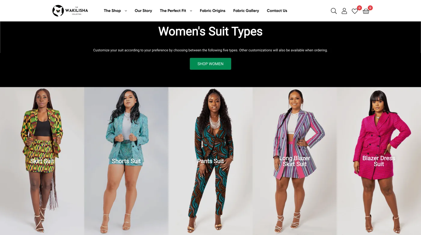
Information architecture
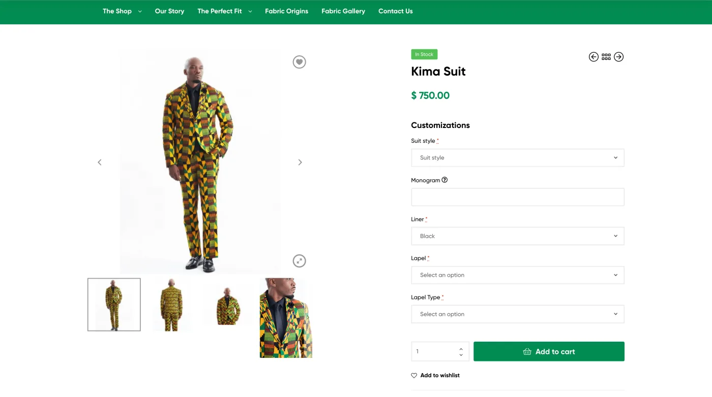
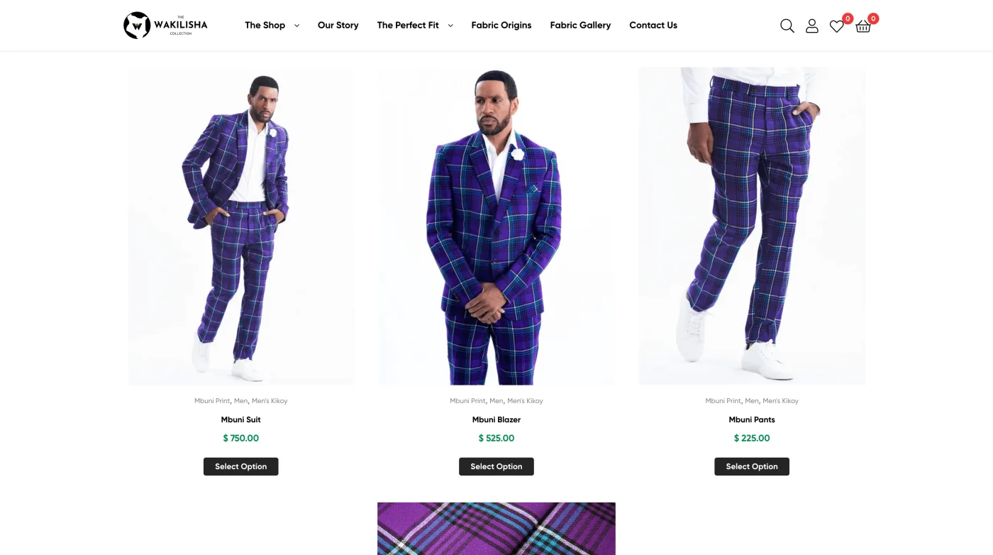
I rebuilt the navigation around how people actually shop, with a simpler menu and dropdowns that surface the main store sections and the story behind the fabric sourcing. The old menu made people hunt. The new one points them straight there.
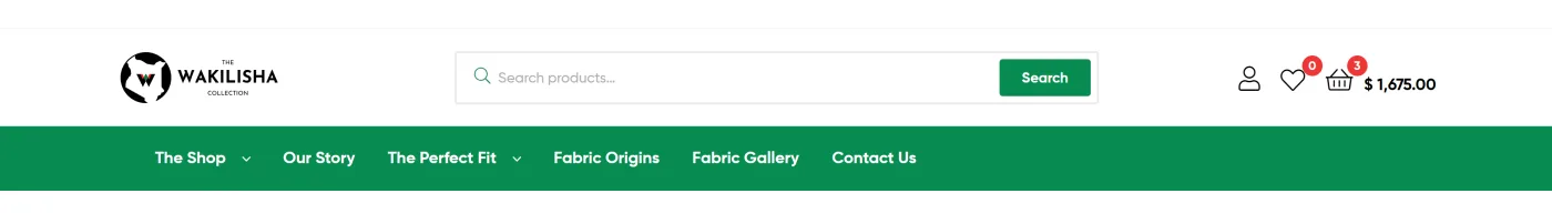
UI & visual design
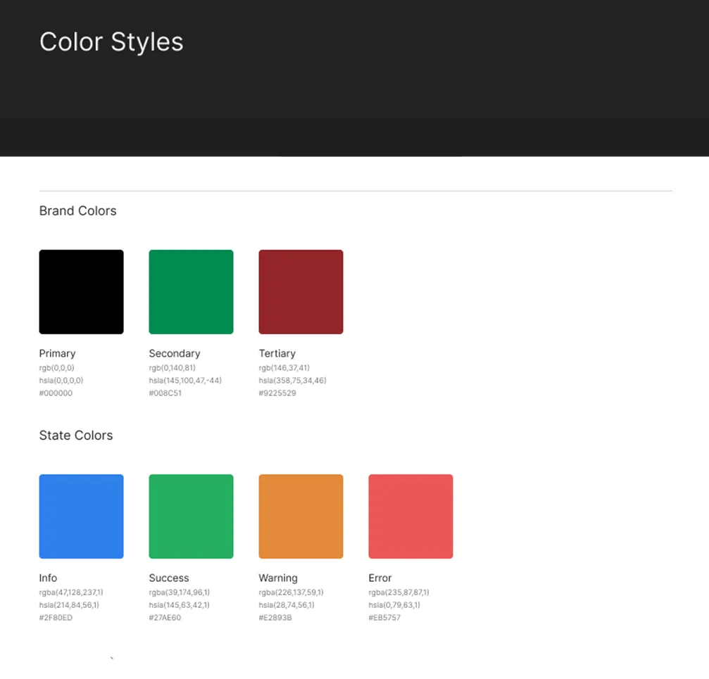
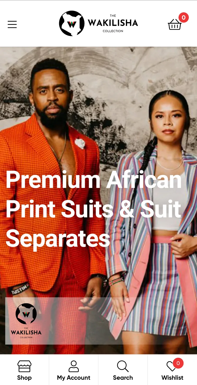
The visual direction started with the brand’s roots. I pulled the palette from the Kenyan flag so the heritage was part of the design instead of an afterthought, then paired it with bold sans-serif type that stays readable and carries some weight.
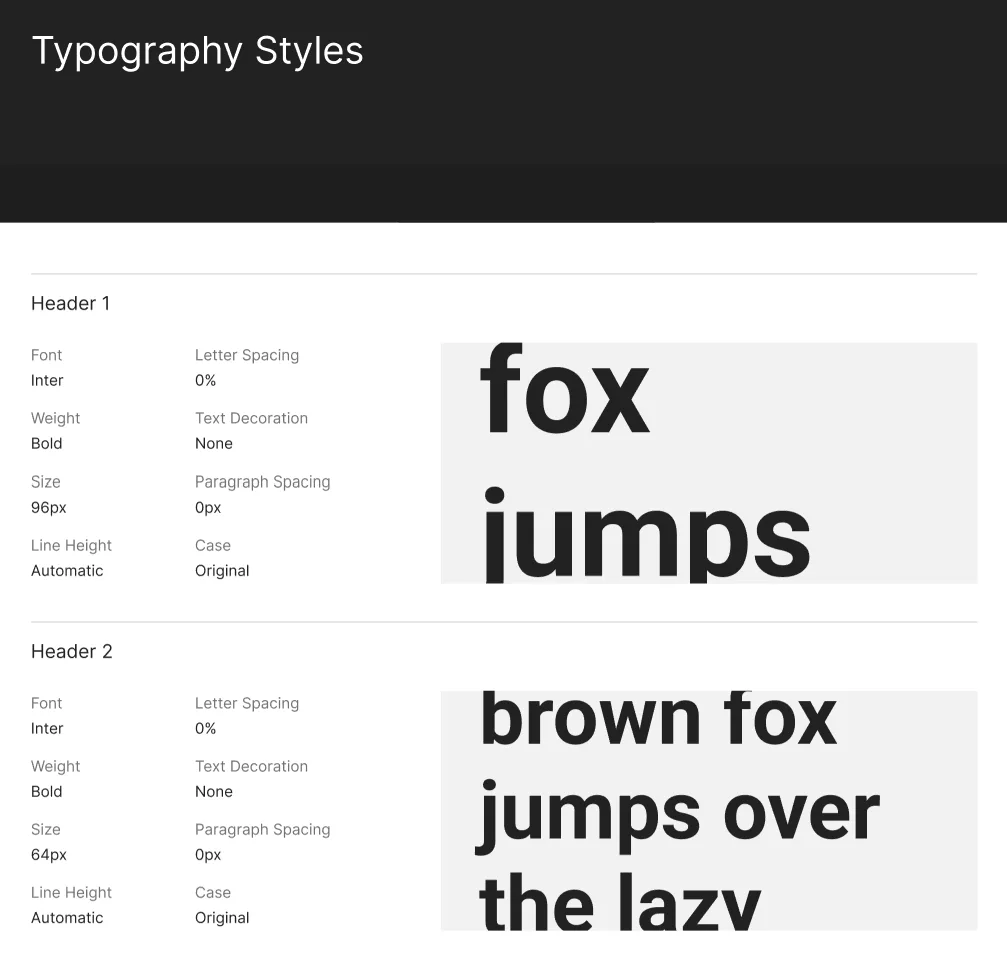
All of it was designed mobile-first, since that is where most of the traffic lived. Responsive images, menus that fold away cleanly, touch targets sized for real thumbs. I also pulled everything into a single style guide so the brand would hold together no matter who worked on the site next.
The checkout got the most attention, because that is where the old store bled customers. I replaced the multi-step flow with a one-page checkout built on FunnelKit, with clear step indicators and a cart that updates as you go. Proper SSL and encryption went in too, so handing over a card felt safe.
Outcome
The brand finally had a store that lived up to the clothing. The identity held together across every page. The site worked properly on a phone. The checkout stopped fighting the customer.
Outcome
Replaced a string of failed redesigns with one cohesive, mobile-first storefront and a checkout built to convert.