Mookie's Mushrooms
A pre-launch functional-mushroom brand. I led the identity and the visual system across web, Amazon, packaging and social.
- Role
- Design lead & product owner: brand, visual system & UX
- Timeline
- 2026
- Platform
- Brand identity · packaging · Amazon · web
- Tools
- Claude Code, HTML & CSS, Obsidian, potrace, ClickUp
At a glance
- The problem
- A new supplement brand had to feel earthy and exact on every surface, before its product names and copy were final.
- What I did
- Design and product-owner calls were mine: look and feel, UX, specs and priorities. I delivered the identity, logo system and palette, the waitlist page's structure and interactions, built in code, a UX audit, and the guidelines agents load.
- Key decision
- Pick the surface first, then the color. No color passes body text on both light and dark, so every component gets a text set per surface.
The work
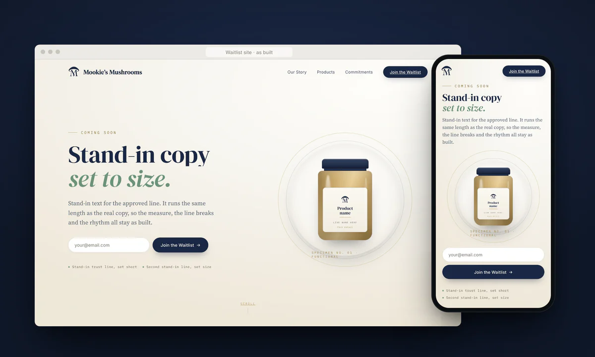
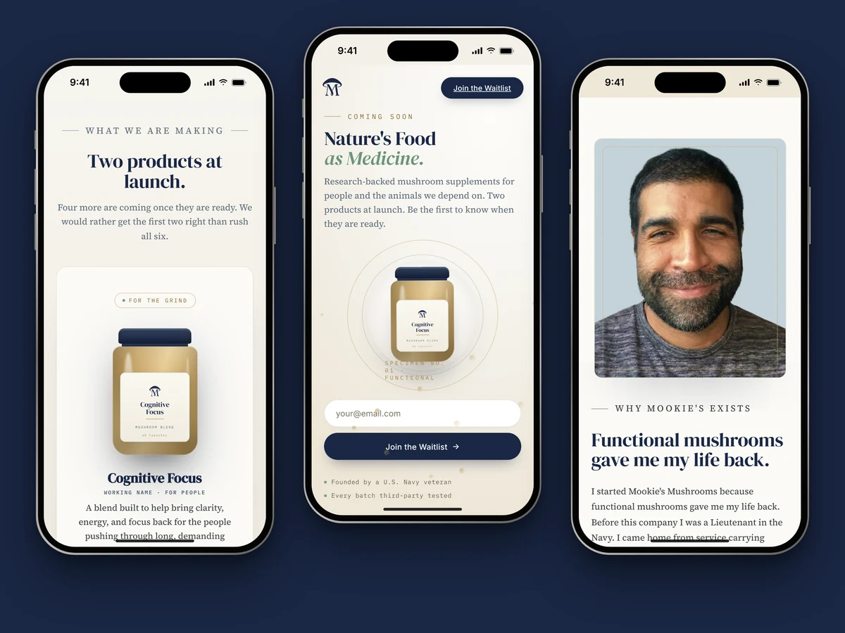
Overview
A functional-mushroom brand from a Navy veteran founder. Pre-launch: waitlist site first, Amazon launch planned after. Each section below leads with the visual; the reasoning and the measurements sit in the deep dives.
The direction: Modern Apothecary
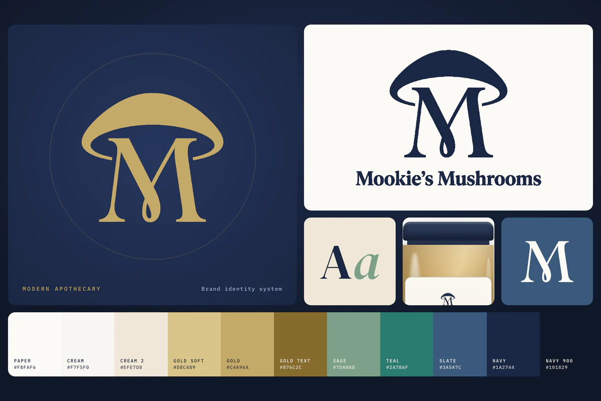
The signed-off identity, Direction B, borrows from the apothecary.
Warmth
Close to the earth.
- Cream
- Cream 2
- Sage
- Gold
Precision
Careful and measured.
- Navy
- Navy 900
- Slate
- Mist
The identity sits between warmth and precision, with navy for steadiness and cream, sage and gold for warmth.
Deep dive Why this direction
The brief pulled two ways: close to the earth, real mushrooms, warm and friendly, and also careful and exact. An apothecary is where those meet, with glass jars, hand-set labels and specimen tags. The identity takes a warm serif with an italic turn, soft radii and pill buttons on a warm ground, set against mono labels like specimen tags, hairline rules and a deep navy anchor.
The original concept put the founder’s Pomeranian on the logo. I proposed moving the dog to the founder story, since on Amazon a dog on a supplement jar can read as a pet product. The signed-off direction did that.
The logo system
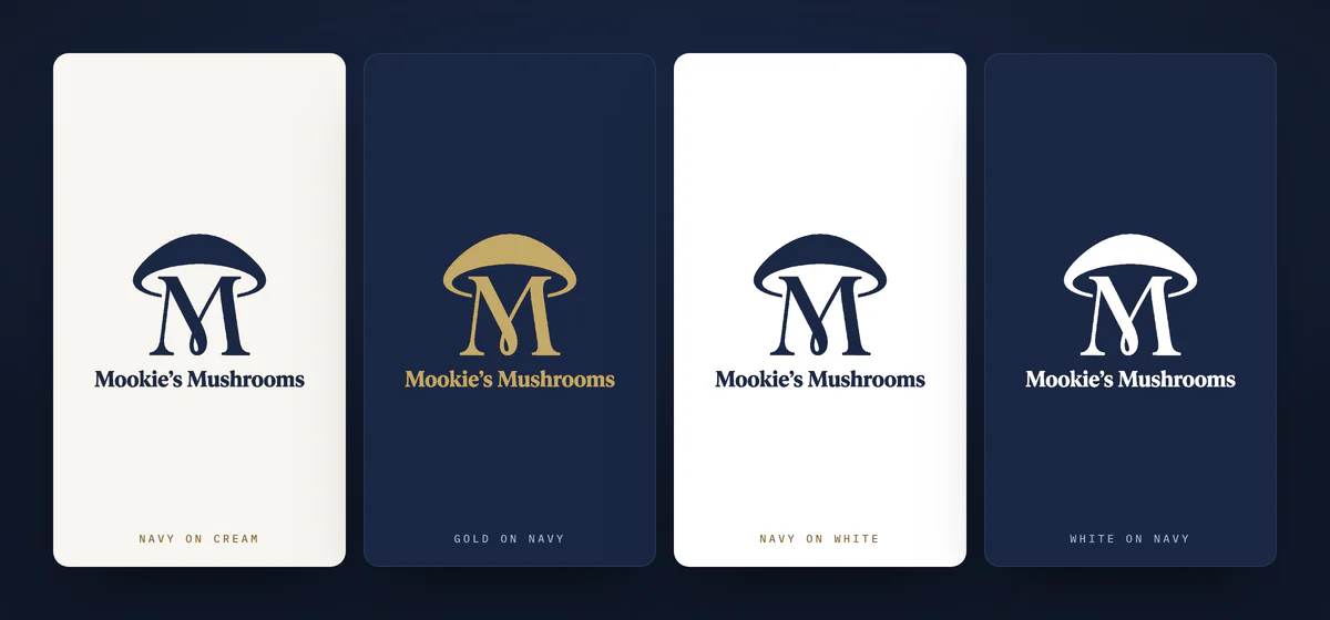
A mushroom cap over a serif M, drawn once and recolored per surface.
Deep dive Lockups, treatments and their ratios
-
Mark and wordmark
-
Mark
-
Monogram
-
Wordmark
Favicon size
Small, the cap and the M run together, so the bare M takes over.
One drawing becomes every lockup, and each treatment is just a token fill that clears the 3:1 bar for logos.
Color is a surface decision
Measured, not eyeballed.
Text on light vs cream
- Ink#1a2744 Body, headings 13.60
- Slate#3a5a7c Secondary 6.57
- Muted#566472 Captions 5.57
- Teal#2a7b6f Success 4.63
- Gold text#876c2c Eyebrows, focus 4.58
Text on dark vs navy 900
- Cream#f7f5f0 Body, headings 16.27
- Mist#c4d9f0 Secondary 12.27
- Gold soft#d8c489 Accents 10.28
- Gold#c4a96a Eyebrows, focus 7.79
- Sage deep#6b9478 Success 5.18
Every text token on the left fails on navy, and every one on the right fails on cream.
Deep dive The grounds, and two corrected values
Grounds
- Paper #fbfaf6
- Cream #f7f5f0
- Cream 2 #efe7d8
- Navy #1a2744
- Navy 700 #16213a
- Navy 900 #101829
Three light grounds and three dark ones, and cream 2 carries no small text.
When I built the site, I measured every pairing instead of trusting how the colors looked. Two values had to change. The guide’s grey for secondary text missed AA on its own ivory ground, and the palette had no gold that could be set as text on light. I darkened one and added the other, and both are written down as deliberate so a brand-fidelity check doesn’t revert them.
Corrected in the build
-
Steel#6b7b8d3.98 changed to Muted #5664725.57 The guide’s caption grey missed AA on its own ground. -
Antique gold#c4a96a2.09 changed to Gold text #876c2c4.58 No gold could be set as text on light. I added one.
Deep dive The surface law, the audit and every ratio No color passes body text on both light and dark, so each surface gets its own text set.
No token works as body text on both cream and navy, so every surface gets its own text set.
A component that appears on both a light section and a dark band gets two color definitions, scoped by surface. The site does this for form feedback, the focus ring and the capture button.
I audited the built site with an agent doing the measuring: every text and background pair, with translucent text composited over its real ground first. Its fix for the success message was one line: use teal. Applied everywhere, that fixes the hero and breaks the footer, where teal reads 3.51:1. The shipped fix is scoped by surface, with a comment in the stylesheet saying why.
One success message, two colors
The failing pairs are set large so they clear the large-text bar here. At body size they fail.
A focus ring is a color decision too
| Token | Hex | On cream | On navy 900 |
|---|---|---|---|
| Ink / navy | #1a2744 | 13.60 Body text | 1.20 Fails |
| Slate | #3a5a7c | 6.57 Body text | 2.48 Fails |
| Muted | #566472 | 5.57 Body text | 2.92 Fails |
| Teal | #2a7b6f | 4.63 Body text | 3.51 Large text only |
| Gold text | #876c2c | 4.58 Body text | 3.55 Large text only |
| Sage deep | #6b9478 | 3.14 Large text only | 5.18 Body text |
| Gold deep | #a8894a | 3.04 Large text only | 5.35 Body text |
| Sage | #7da088 | 2.66 Fails | 6.12 Body text |
| Gold | #c4a96a | 2.09 Fails | 7.79 Body text |
| Slate soft | #9fb3d5 | 1.95 Fails | 8.34 Body text |
| Gold soft | #d8c489 | 1.58 Fails | 10.28 Body text |
| Mist | #c4d9f0 | 1.33 Fails | 12.27 Body text |
| Line | #e7e3d8 | 1.18 Fails | 13.82 Body text |
| Cream | #f7f5f0 | 1.00 Fails | 16.27 Body text |
Type
Four families, one job each.
Be first in line.
Join the waitlist and you will be the first to know when we launch.
The waitlist
The serifs carry the brand, and Inter only runs the interface.
Designing the waitlist experience
Before launch, the page has one job: turn a skeptical visitor into an email on the list.
-
Arrive
- Sticky header
- Hero Signup
-
Understand
- Promise line
- Products
-
Trust
- Founder story
- Commitments
- Trust bar
-
Join
- Waitlist band Signup
-
Reassure
- FAQ
- Footer Signup
Planned for launch: the header button becomes Shop on Amazon, and the other signups stay as email capture.
The page asks for the email up front, again once trust is built, and once more at the very end.
Deep dive What a visitor needs, and why the page is ordered this way
Launch audience
- Busy professionals
- Athletes
- Biohackers
- Small farmers
Buyer profile Veterans, skeptical by default.
Their questions, and where the page answers
- What is this, and is it for me? Answered by Hero
- Who is behind it? Answered by Founder story
- Can I trust it? Answered by Commitments
- When, and where do I buy? Answered by FAQ
- What do I get for my email? Answered by Waitlist band
Every section on the page exists to answer one question a skeptical visitor brings.
I wireframed the page in greyscale first, on purpose, so the founder’s feedback landed on structure and message rather than on shades of navy. Each section has a stated purpose.
- Hero. Pass the five-second test: say what this is and who it’s for, and ask for the email before the visitor scrolls.
- Promise line. A short breath that states the philosophy and earns the scroll. It was marked as the first cut if the page ran long.
- Founder story. The trust anchor. Skeptical visitors join because of the person behind the brand.
- Commitments and trust bar. The reasons to believe, written as intent until review clears, placed right before the main ask.
- Waitlist band. The dedicated ask for anyone who scrolled past the hero, with nothing else around it.
- FAQ. Remove the last objections, and quietly set the expectation that the buy happens on Amazon.
Each block also notes what it becomes at launch, so the page can flip from waitlist to Amazon funnel without a rebuild.
Deep dive Form, FAQ and nav decisions
Waitlist form · one field, four states
- Empty your@email.comJoin the Waitlist
- Invalid hello@exampleJoin the Waitlist Please enter a valid email address.
- Sending you@example.comSending…
- Success you@example.comJoin the Waitlist You are on the list. We will be in touch the moment we launch.
FAQ · one open at a time
Each pattern keeps the next step in reach and degrades cleanly without JavaScript.
The form. One required field. The founder and I settled on email plus an optional interest toggle, so the list could be segmented without adding friction. Validation runs inline on blur, clears as soon as the entry is fixed, and returns focus to the field. The button guards against double submits, the field uses email autocomplete, and since the audit every error is tied to its input with aria-invalid and aria-describedby. Success and error colors are scoped per surface, so both read on cream and on navy. On small phones the field and button stack. The product cards’ notify links preset the interest and jump focus to the email field.
One gap is still open. The hero and footer forms submit without an interest value, so only the main band segments the list. My read is that it’s a defect against the agreed segmentation, and the fix is a toggle in the hero.
The FAQ. Native details and summary with a shared name, so only one answer is open at a time, with no script. Older browsers fall back to independent items. It sits after the main ask, because its job is the last objection, and at launch the timing question becomes a where-to-buy question.
The nav. A sticky header with a skip link, anchor links instead of pages, and Join the Waitlist always visible. On tablets and phones the links fold away and the button stays. On small phones the full lockup gives way to the mark. At launch the button becomes Shop on Amazon.
Deep dive The UX audit, and the measured fixes
I ran a UX/UI audit of the built site with an agent doing the measuring. It covered Nielsen’s heuristics, WCAG 2.1 and 2.2 AA, the path from hero to waitlist, and a responsive walk at phone, tablet and desktop widths. Every text and background pair was computed, with translucent text composited over its real ground, and every interaction was tested live.
| Fix | Before | After |
|---|---|---|
| Footer form error color | 2.92:1 | 9.04:1 |
| Legal disclaimer line | 3.26:1 | 6.21:1 |
| Footer legal row | 4.06:1 | 5.41:1 |
| Success message on light | 3.14:1 | 4.63:1 |
| FAQ open and hover title | 3.17:1 | 4.77:1 |
| Footer sign-up button vs footer | ~1.2:1 | 17.73:1 |
| Focus ring on light sections | 2.09:1 | 4.58:1 |
| Page with JavaScript off | Blank | Renders |
| Errors tied to their inputs | No | aria-invalid, aria-describedby |
It also confirmed what held: inline validation and focus return, the exclusive accordion, no horizontal overflow at any width, landmarks, a skip link and a single h1.
Four conversion ideas came out of the audit and were flagged for the founder rather than applied, because each changes signed-off copy or structure: a concrete founding-member incentive, the FAQ higher on the page, the interest toggle in the hero, and early third-party social proof.
One more turned up while I prepared this page. The FAQ has its own focus rule that still uses gold on paper, at 2.18:1, below the 3:1 bar. It’s flagged for the next pass.
One system, every surface
The waitlist site
Deep dive Three hero directions
Copy replaced with stand-in text
-
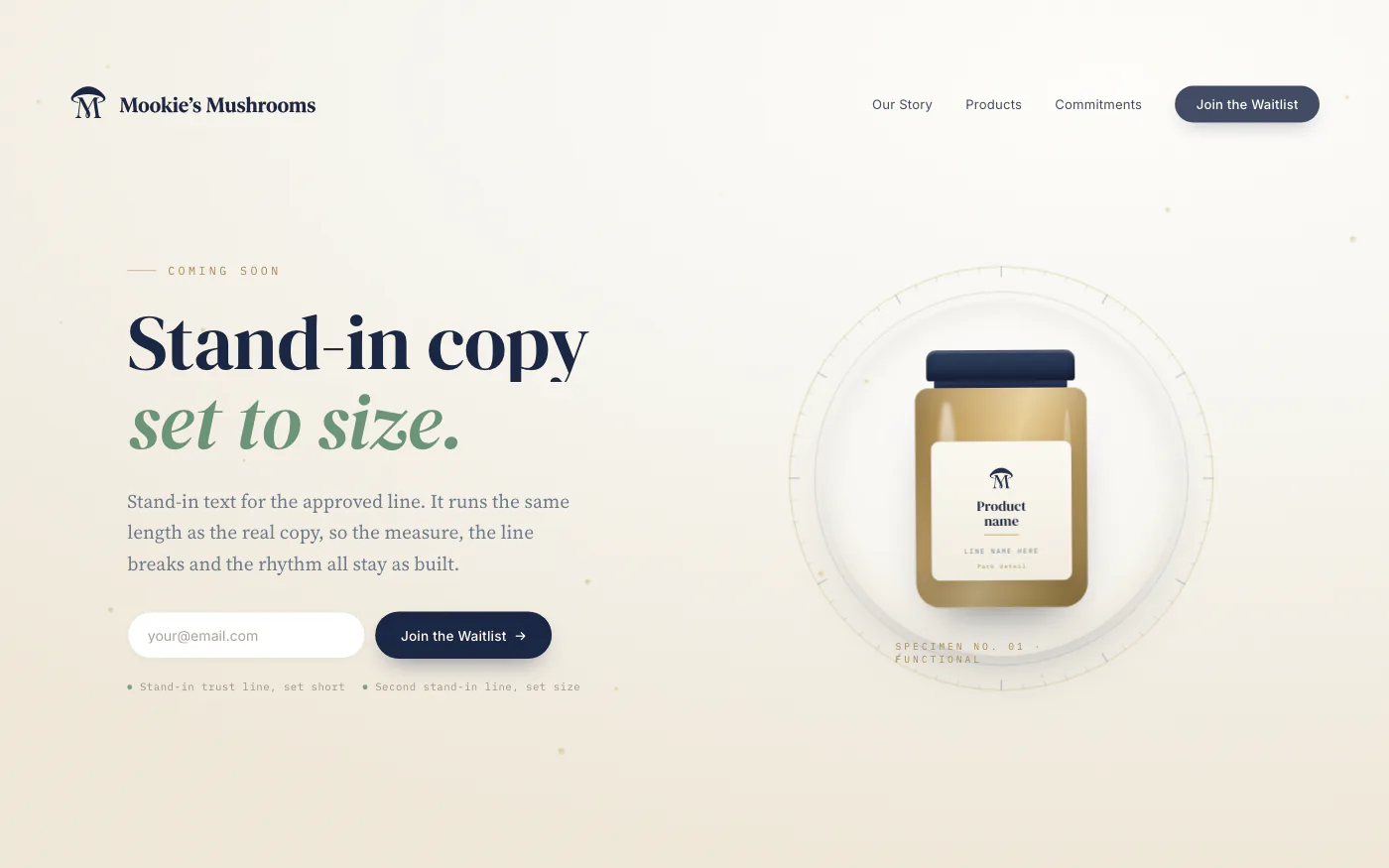
1 The Apothecary Chosen
Cream-forward, the jar in a specimen ring.
-
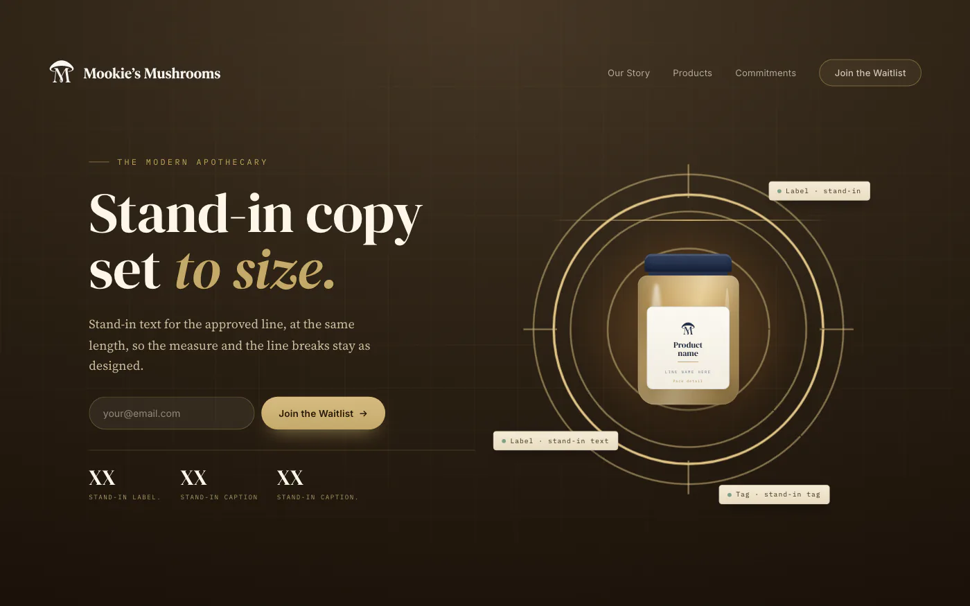
2 The Apothecary Lab
Its lab-readout tags would all need claim review.
-
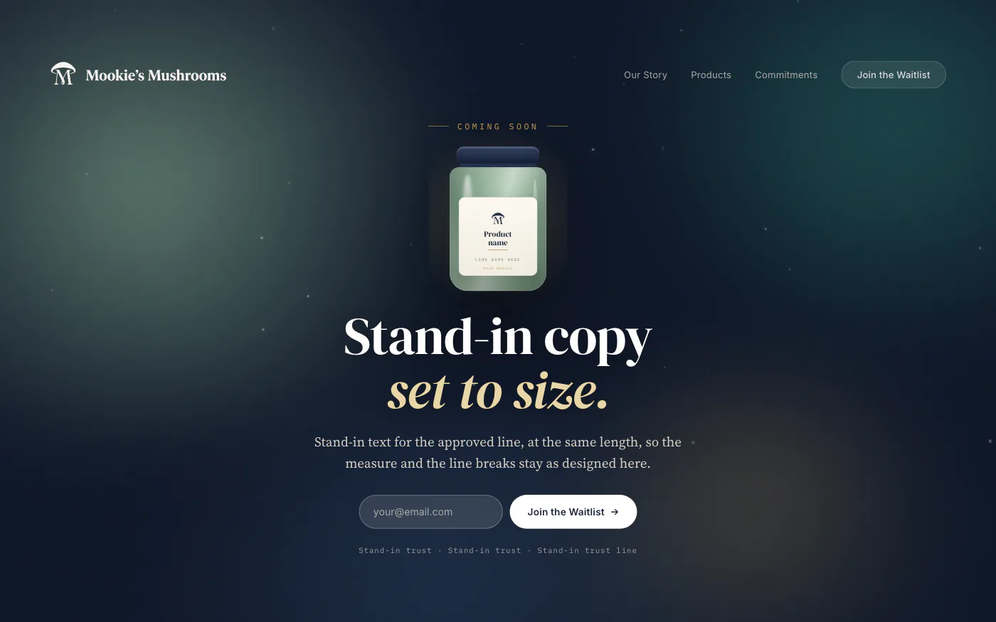
3 Living Earth
An aurora of brand greens around a glowing jar.
One identity made three worlds, and the founder picked the calm, cream-forward one.
Deep dive How the site is built, and more of it as built
The site has one page and two jobs: build the waitlist now, and send people to Amazon at launch. Every section can swap “Join the Waitlist” for “Shop on Amazon” without a rebuild.
I built it in code from the system: one spacing scale, two shared rhythm values that every section uses, pill-shaped controls and touch targets sized for thumbs. Motion has fallbacks for reduced motion and for browsers where animation stalls, and the page renders in full with JavaScript off.
The first identity doc set body copy in Inter. I moved it to Source Serif 4 in the build, which matched what the style guide already said. Leading rises with the measure: tight at display sizes, loosest in the longest column. The mono is always uppercase and tracked.
Hero copy replaced with stand-in text
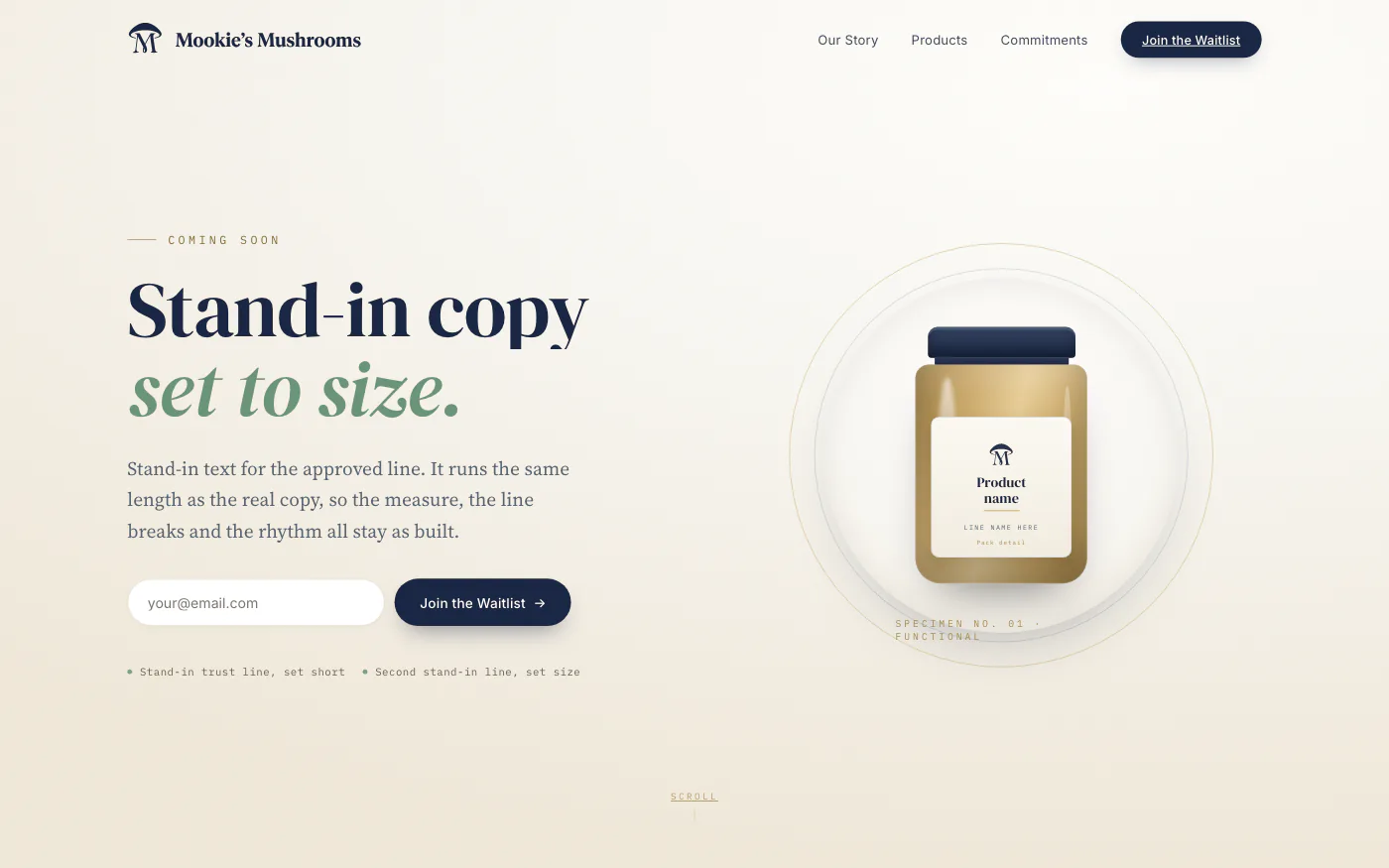
The build follows Hero 1 closely.

On a phone, the mark stands in for the lockup.

On navy, type switches to the dark text set.
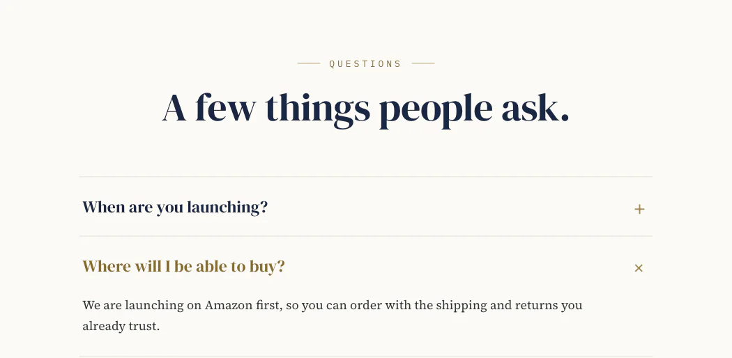
On paper, an open question turns gold text, at 4.77:1.
Every section takes its text set from its ground, down to the focus ring.
Amazon
-
Background with text
Used -
Logo and description
Used -
Focus image with text
Used -
Brand Q&A
Used -
Product showcase
Held -
Brand commitments
Held -
Reserve
Held
The approved founder story only fits Amazon's Q&A field, so it runs there word for word.
Deep dive Why claims stay off Amazon
On the waitlist site a line can state an intention. On Amazon the same sentence sits next to a buy button and reads as a statement about a product for sale, so nothing claim-like goes on the Amazon layout until it’s cleared. The one headline that had to be shortened for a module is flagged for the client’s sign-off.
The main product image is the one place the brand doesn’t appear: product on white, nothing else. The brand lives in the supporting images and the Brand Story. In every Amazon template, anything per-product is a variable, so naming the products is an edit, not a redesign.
Packaging and social
Label art waits on final names and review.
Deep dive The jar language, and what changes in print
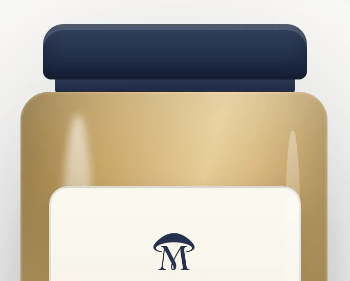
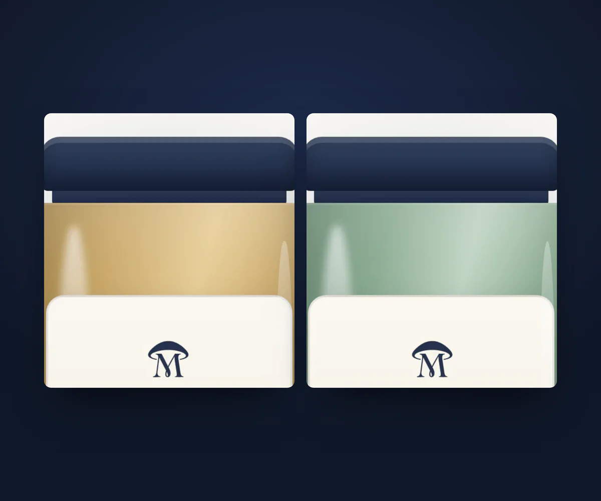
Navy lid, tinted glass, the mark on a cream label.
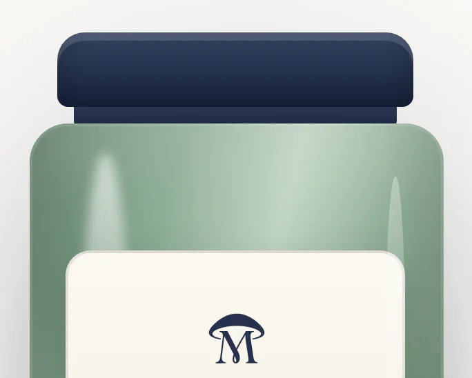
Only the tint changes, and the lid, label and mark stay fixed.
Crops are taken above the product names, which aren't final.
- Contrast ratios are a screen measure. A label is read on a curved, matte surface in real light.
- Golds and mid greens shift most in print, so the palette gets a printer’s proof before the first label.
- The supplement facts panel is laid out to the regulation, not styled to the brand.
- The die-line comes from the printer, and the artwork is built to theirs.
Deep dive Social: avatar, highlights and safe zone
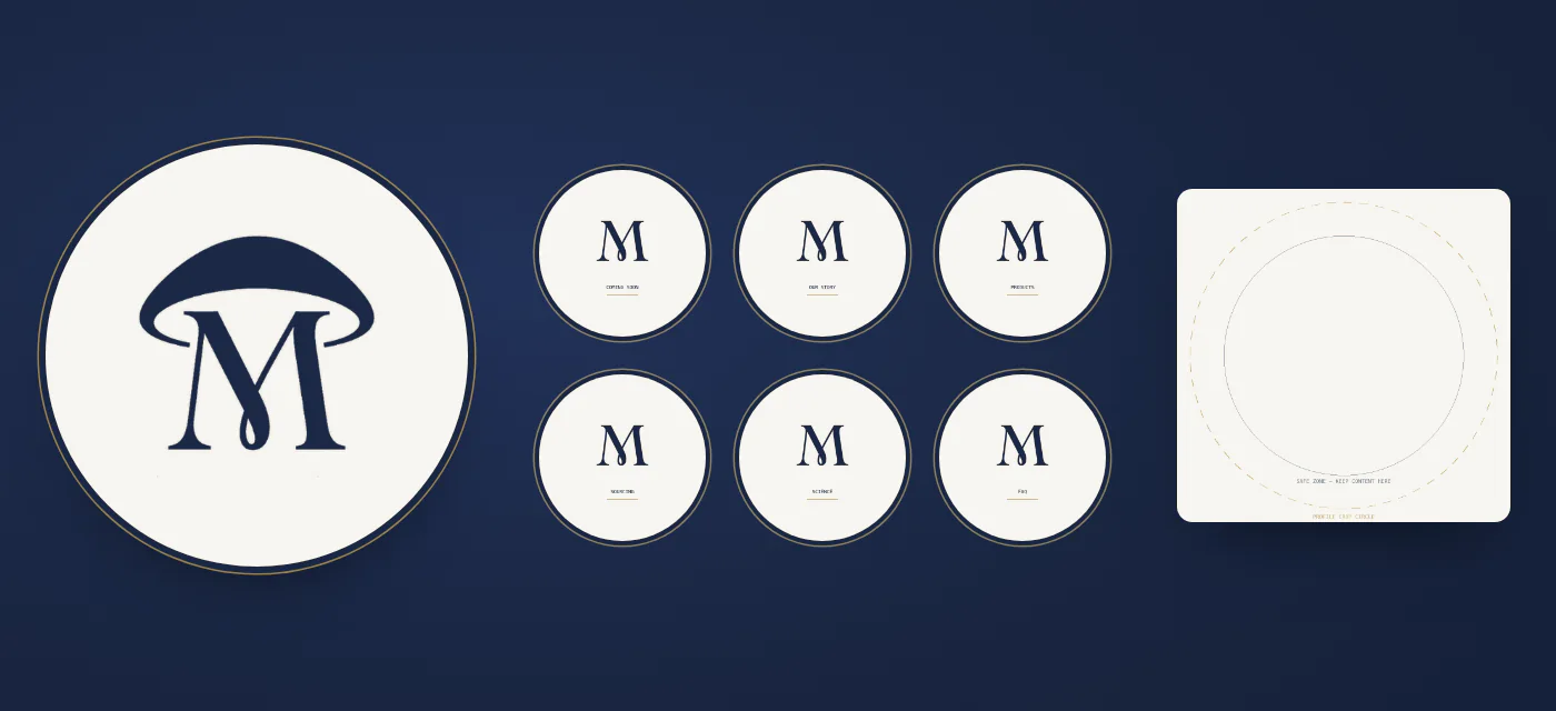
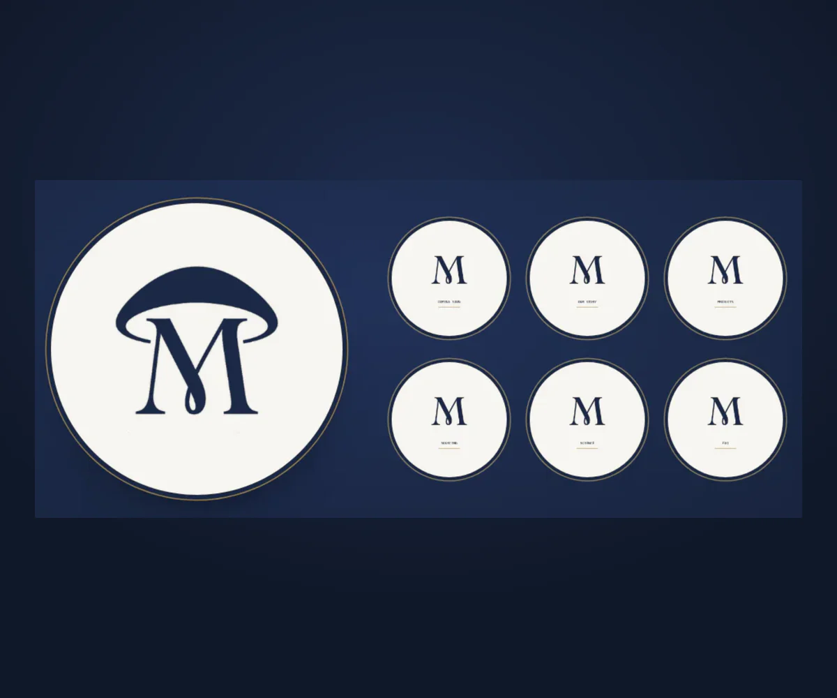
The bare M carries the small highlight covers, where the full mark would blur.
Documentation
A client style guide, and under it a design-system skill for whoever builds next, human or agent.
Deep dive Which source wins, and what each holds
- Wins on values The shipped stylesheet
- Wins on rules The design-system skill
- Wins on intent The identity doc and the style guide
When sources disagree, the stylesheet wins on values, the skill on rules, and the identity doc on intent.
The shipped stylesheet is the audited, measured implementation, and it wins on values. The design-system skill holds what code can’t: forbidden pairings, what each component is for, and how the system changes between screen, label and Amazon. Agents load it before any design work. The identity doc and style guide hold the direction, the logo system and the voice, and they’re superseded on values where the divergence register says so.
The divergence register lists every place the shipped system departs from the identity doc, and why, so a brand-fidelity pass doesn’t undo an accessibility fix.
AI in the loop
The vault is the source of truth, agents load the design-system skill first, and submitted is not accepted. More in AI-Native Product Workflow.
Outcome
Pre-launch: identity signed off, waitlist site built, Amazon launch planned, and every surface on one set of tokens.